
Getting started on this project involved extensive research. In order to conduct a competitor analysis I scanned competitor sites, read reviews of their products and even scheduled demos with most competitors to gain insight into their products advantages and disadvantages. I also conducted some market research to gain a better understanding of the potential of this idea.


The mobile app was a core piece of the success of this product and it was the area were the User Experience had to be the strongest. I worked to create an experience that was easy to interact with and allowed users to navigate the complicated incentive campaigns in an easy and visually appealing form. The color palette aimed to be exciting but was left intentionally open in order to accommodate the different company's logos and branding which would feature on the header. We also wanted to make sure we didn't have a color palette that would represent any company's competitors, so we used multiple colors from across the color wheel.

.png)
.png)
.png)


.png)


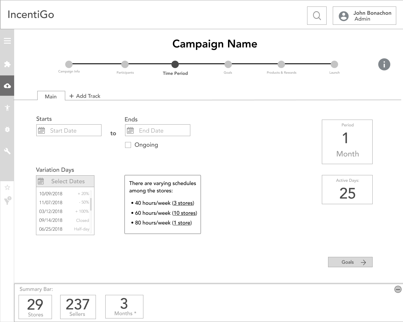
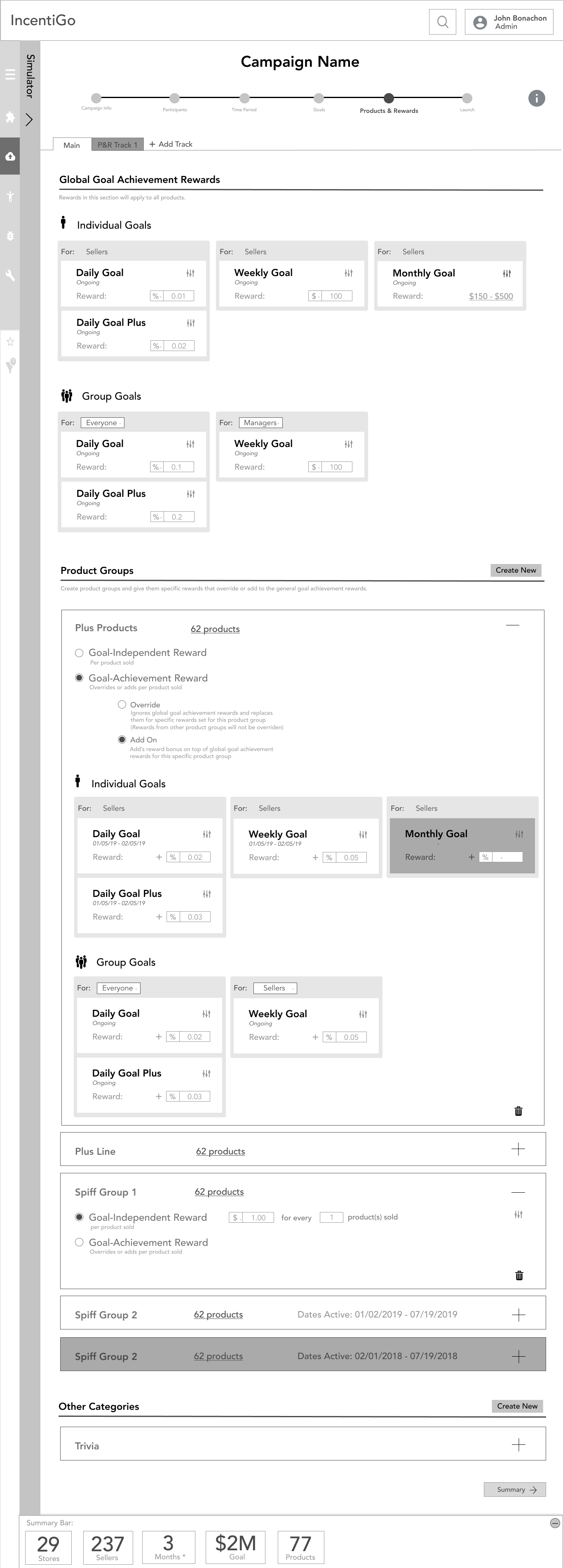
The web app proved to be extremely complex to design. By working together with the CTO through innumerable meetings we were able to create an experience that included all the complex scenarios and allowed for extreme customization while being user-friendly and easy to understand. I've included the Wireframes without the Hi-Fidelity designs in order to illustrate more the of the ideation process and focus on the complexities we had to tackle.


For this website I had to work extremely quickly and collaborate with a copywriter the company hired. I worked as the Web Designer as well as the Web Developer. I Developed the site using Webflow.
View Live Site

.png)
